The ONE DAY Re-design!
/The One Day Redesign
A design tale of Brooklyn proportions
Let’s immediately dispense with the BEFORES & AFTERS, shall we? That’s the eye candy. That’s the heart of the home makeover story, right?
But, this is a different story…where the home could not possibly outshine it’s occupant. We just wanted to elevate it to be worthy!
And that is the story of this one day redesign on a cold but sunny January day on Elliot Street in Brooklyn, NY, when Team beam&bloom took a whirlwind 5 hours to try to give a beautiful person the beautiful space that she deserves.
after
Before
after
before
after
before
after
before
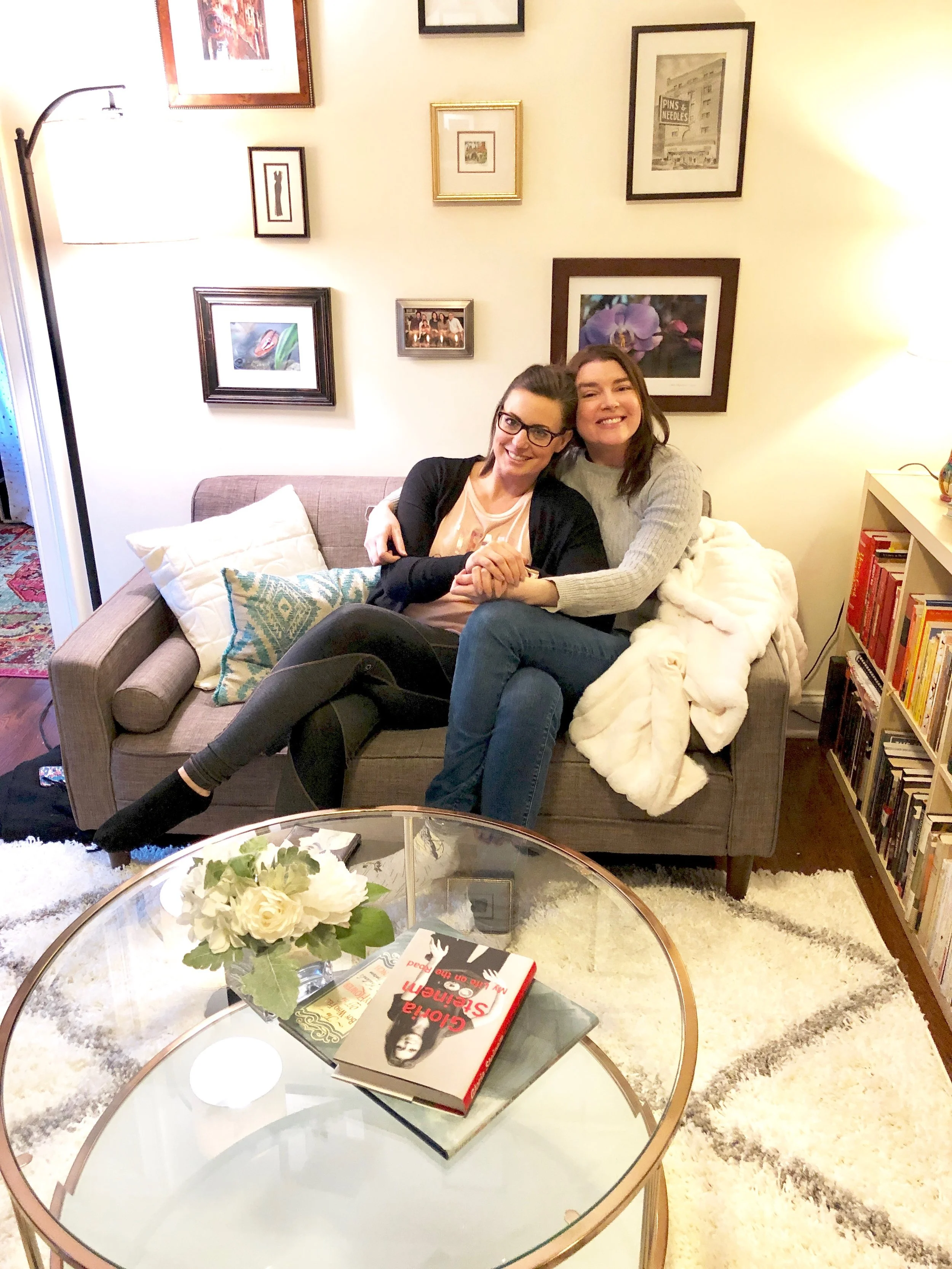
Noel & Becca….hugging and lounging. The only thing missing is chewy chips ahoy.
My dear friend, Becca, has been a steadfast part of my life for…many years. We’ve grown up together in a myriad of ways. We’ve been friends since sophomore year of high school. We’ve seen each other follow different life paths, but always with shared values, interests and dreams for ourselves, our families, our friends and our world.
We’ve both had an especially intense year, full of highs and lows. There were joyful family births, new and old friendships, career successes and falls and then, for her, an unwelcome health issue that took some wind out of the sails for a bit. But, in proper Becca fashion, she has weathered the storm to come out stronger, wiser and as determined as ever to live every moment of her beautiful life without limitation. She truly embodies the strength and beauty of the beam&bloom mission, and the integrity and creativity that I strive for in every design project.
So…
I decided I wanted to give her the gift of a transformed space after a transforming year. Really, it was a gift for the both of us in a multitude of ways. To start, she got some pampering, and I got some creative freedom to “surprise” her with a one day re-design of her space! And, off my team and I went for a whirlwind day of decorating!
Actually, it was 5 hours on the nose.
Team beam&bloom
Kristin K., Jackie l., liz l., liz f., noel g.
It took a few weeks of planning, gathering, purchasing and plotting to make it possible, but we had an absolute blast spending the day making her little “house” a home.
Actually, it’s a studio apartment in the lovely Fort Greene neighborhood of Brooklyn, NY.
In Becca’s neighborhood next to Spike Lee’s Studios
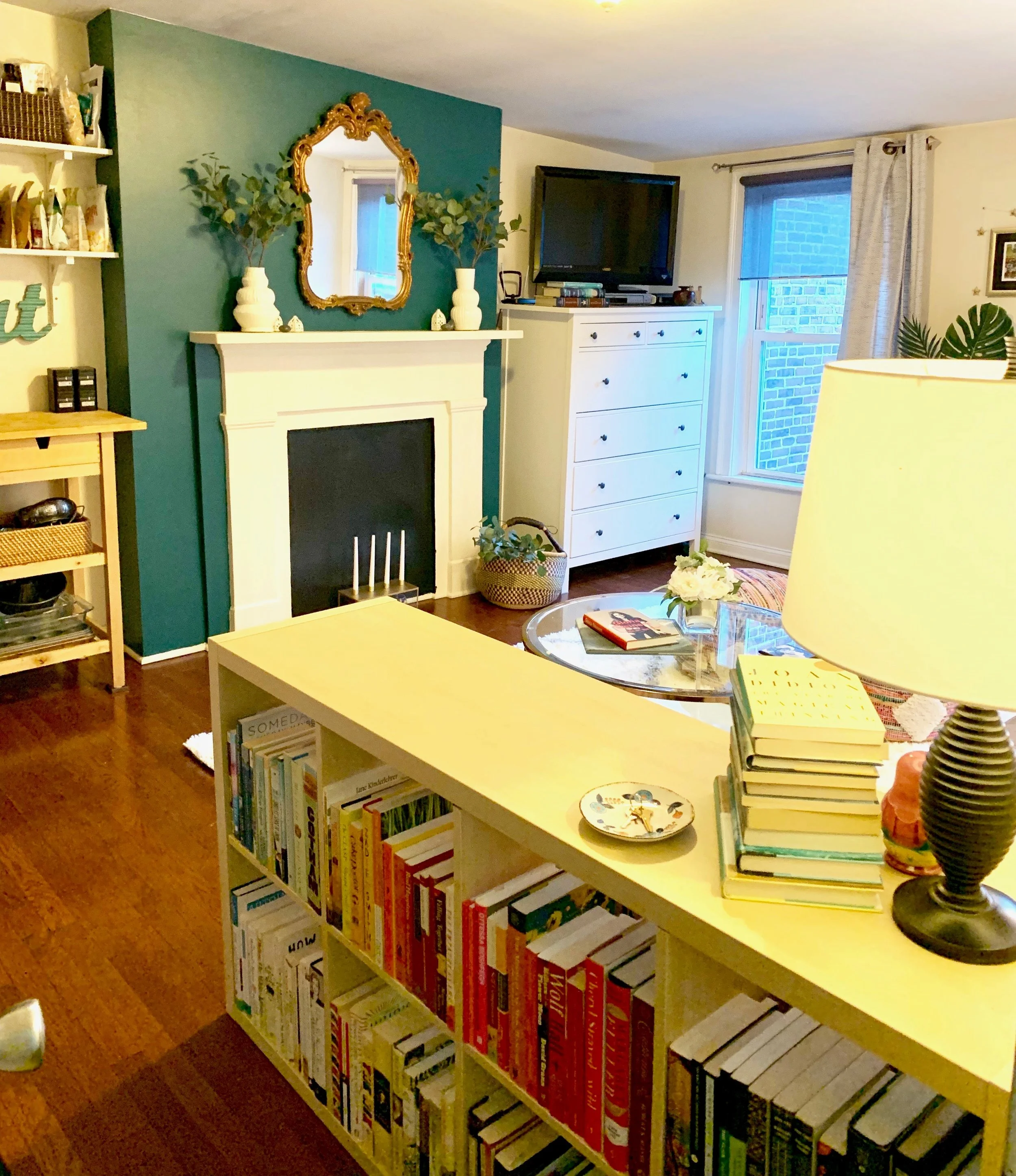
The “Living Room” is actually an entryway/living room/kitchen/dining space. We wanted to make an impact with the dynamic fireplace wall in a stunning Dark Teal by Benjamin Moore. We painted the “fireplace” itself a semi gloss black to reflect the light from the Hearth & Home Candelabra that we chose to add height, interest and ambiance.
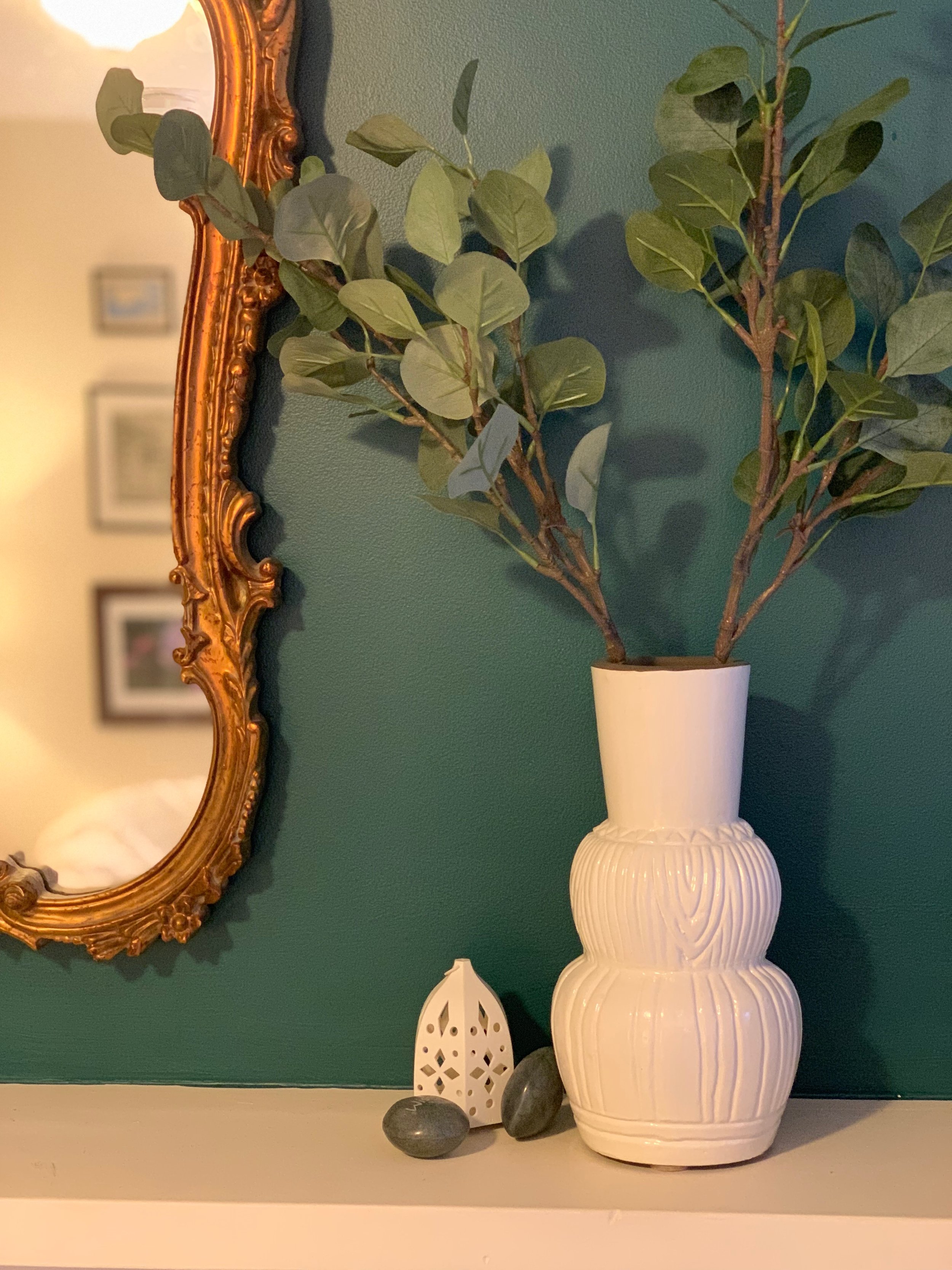
The white Opalhouse from Target vases are versatile, simple and striking against the teal wall, while still allowing the stunning vintage gold mirror to shine.
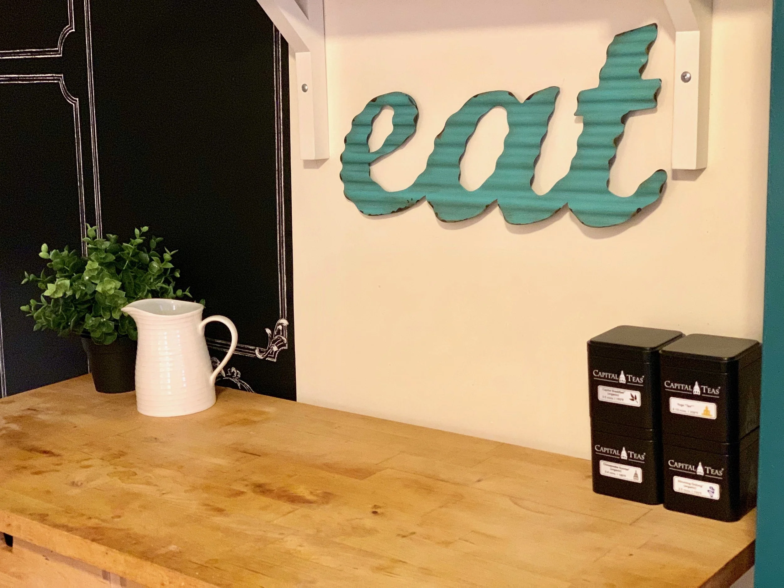
The kitchen got a little face lift with some editing, organizing, creative design and some remnant Magnolia Home chalkboard (you can actually chalk on it) removable wallpaper from a previous project. This sweet little feature was expertly papered by the lovely and talented beam&bloom project manager, Kristin K.! The teal metal “eat” sign is a pop of color, and nice reminder!
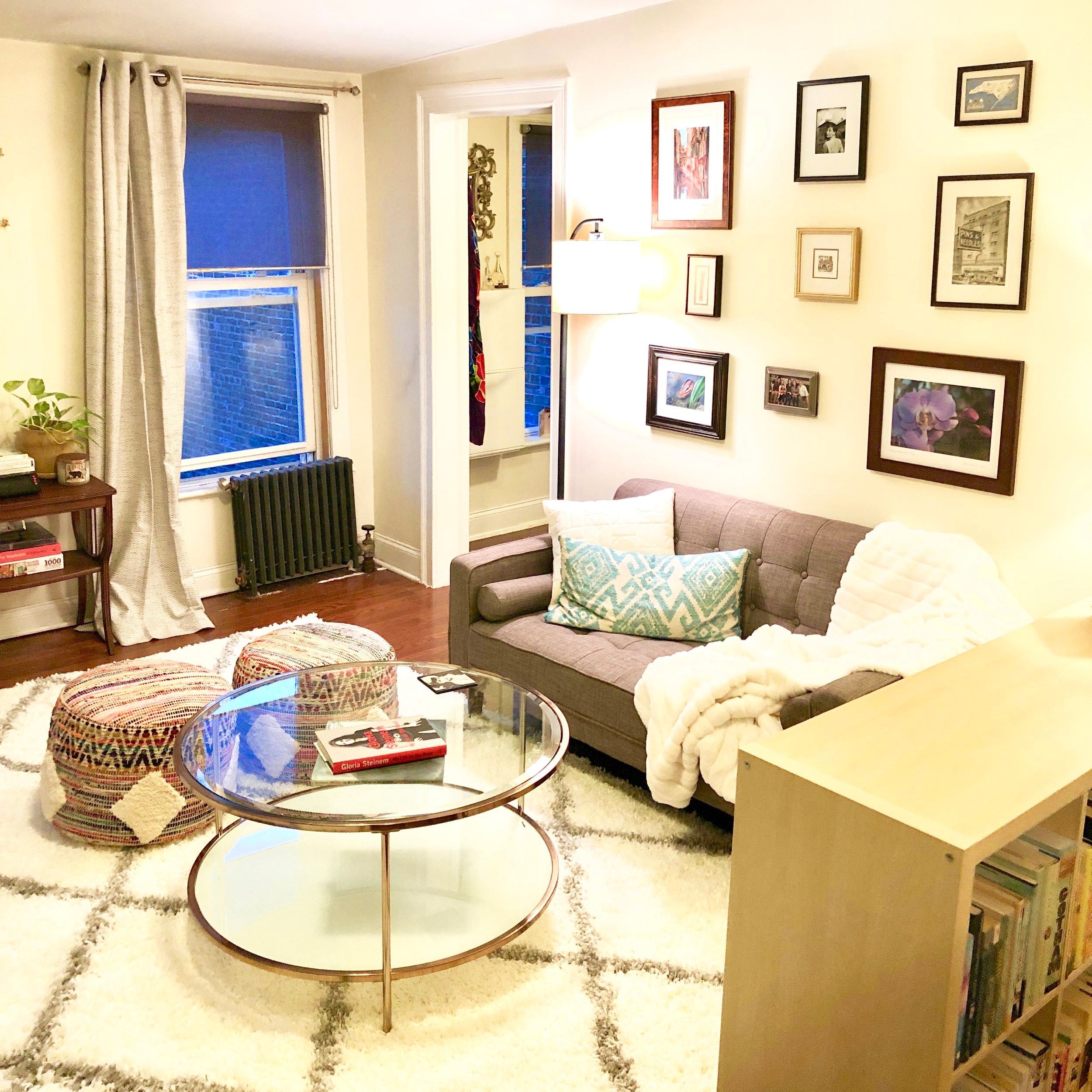
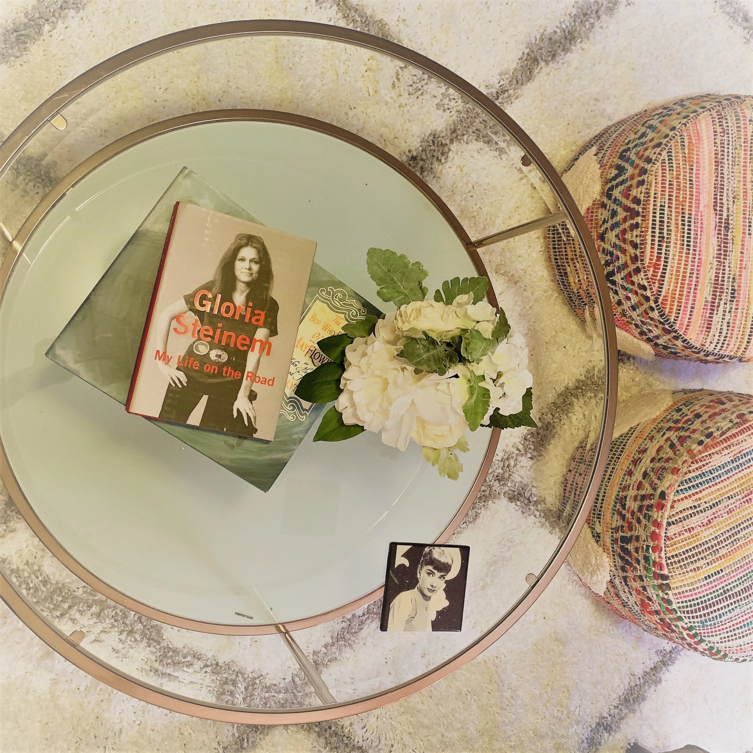
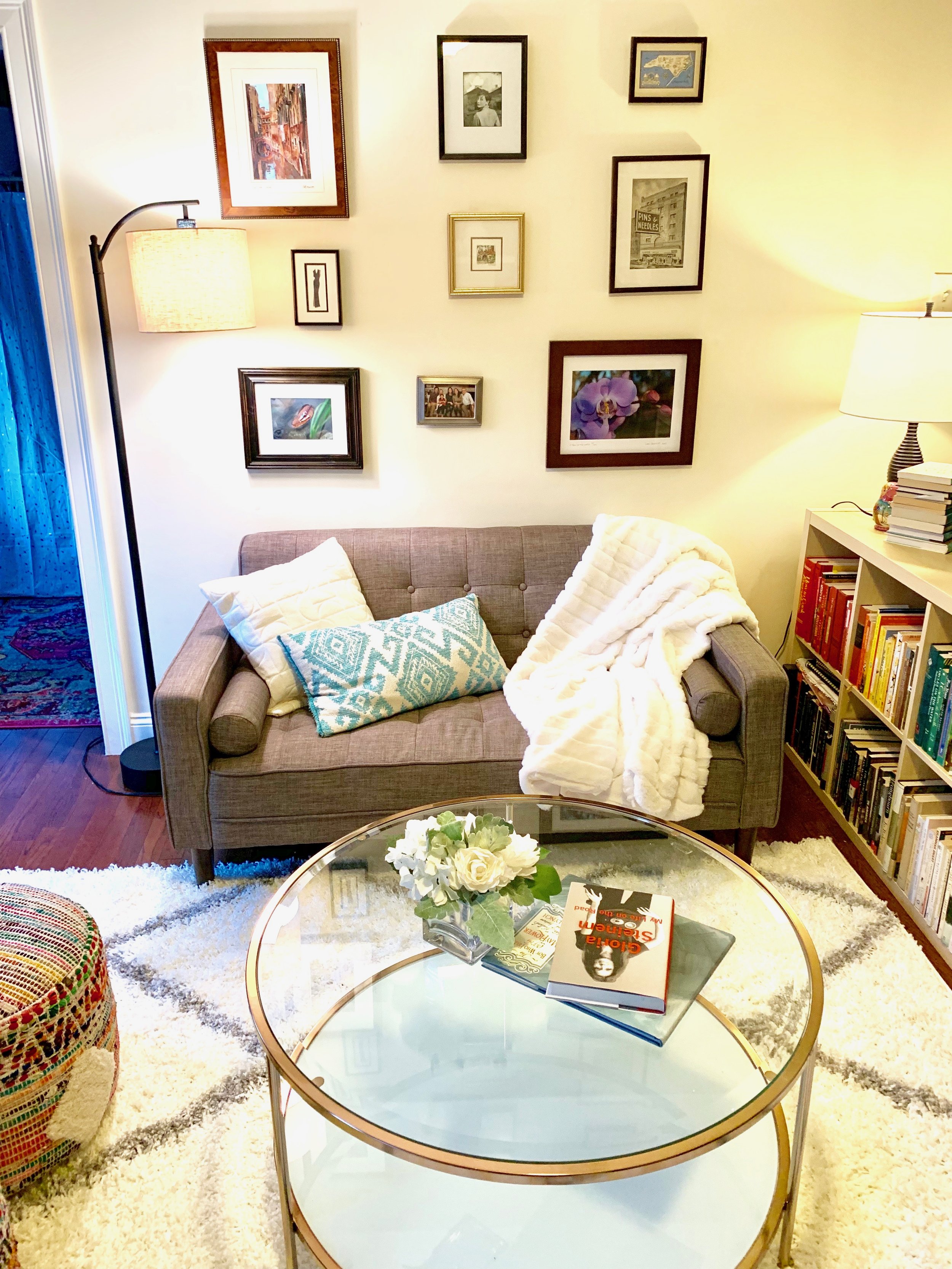
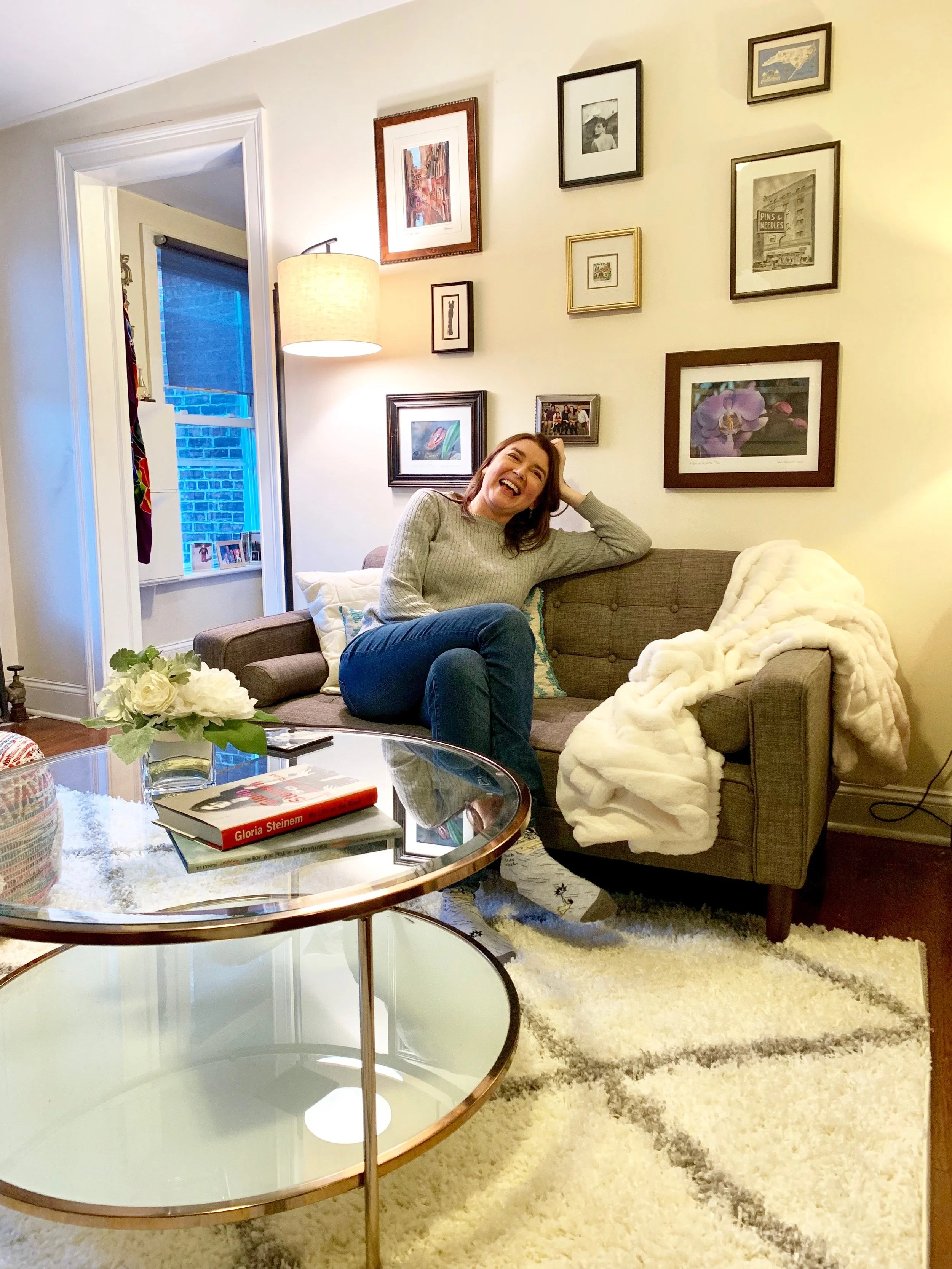
Becca’s story is everywhere in her home. We even picked a pretty teal book to display called “The Boy Who Fell off the Mayflower” about HER ancestor! We topped it with a little Gloria Steinem for balance of old and new tales to tell. The glass coffee table with a milky glass bottom shelf adds some shine and clarity to the open space. The global style poufs provide seating for visitors, a comfy place to rest your feet while lounging on the sofa AND the colors of the rainbow! The plush rug is bright, soft and neutral enough to brighten and blend with any space.
glass coffee table & multicolored global poufs
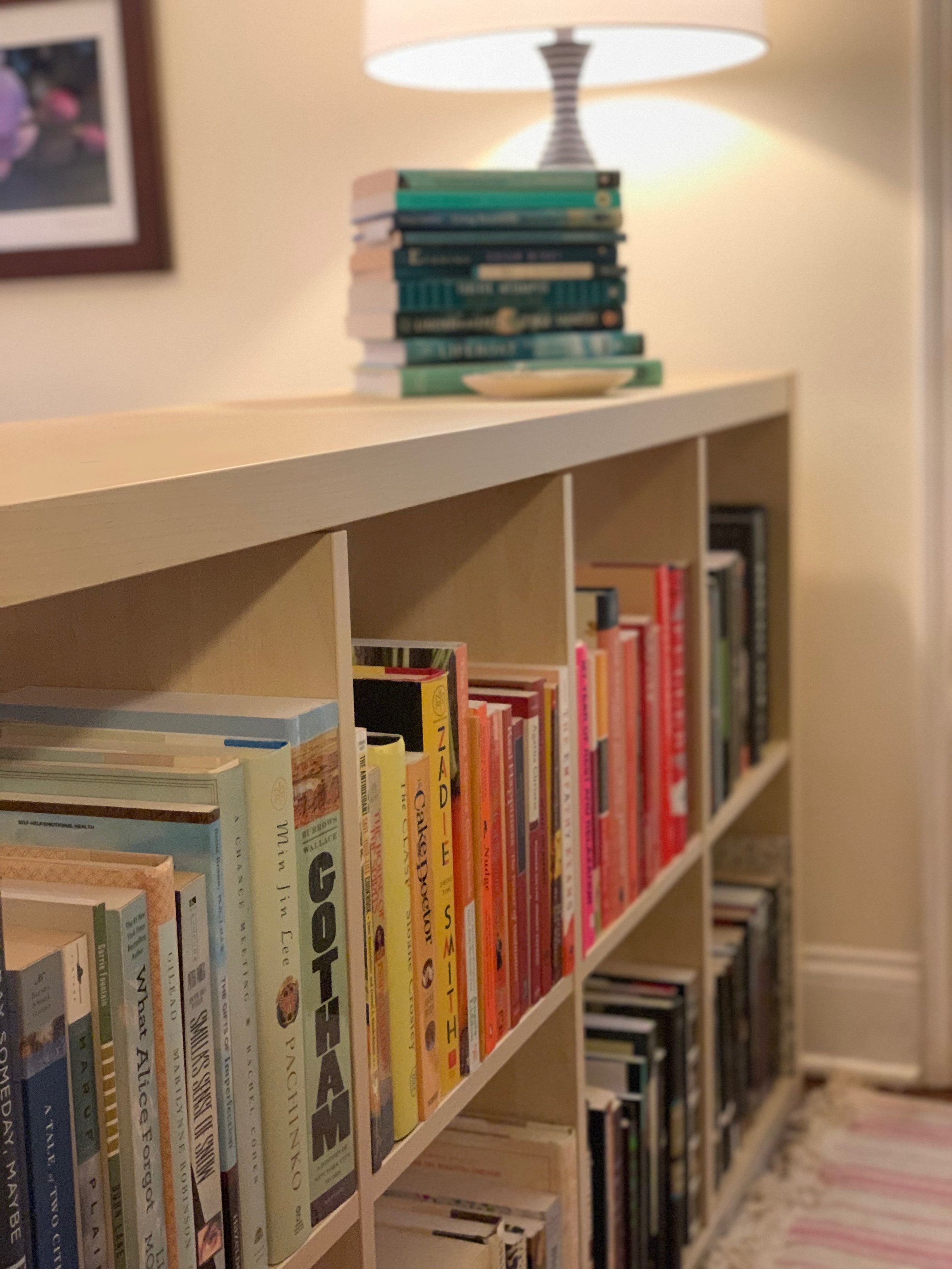
Becca is a bibliophile (and a genius…but I digress), thus we HAD to keep her double sided bookshelf which we flipped on it’s side to keep the “entryway” separate but the floor plan nice and open. My talented project manager, Liz F., created a book rainbow! The color and life that it provides is amazing, and, oh, the stories it tells. If one could read every book on this shelf, one would be better for it.
Ever the explorer, Becca has art that she has collected from all of her favorite geographical locations. She studied in Virginia, Austin and London and has traveled extensively. Her background and profession in Theatre Arts gives her an eclectic and global view of people and places, and an incredibly positive perspective on the beauty of humanity despite the symbiotic darkness. We created a gallery wall of some of her favorite people, places and things anchored by a modern mini sofa, a super soft throw blanket and some pretty plush pillows.
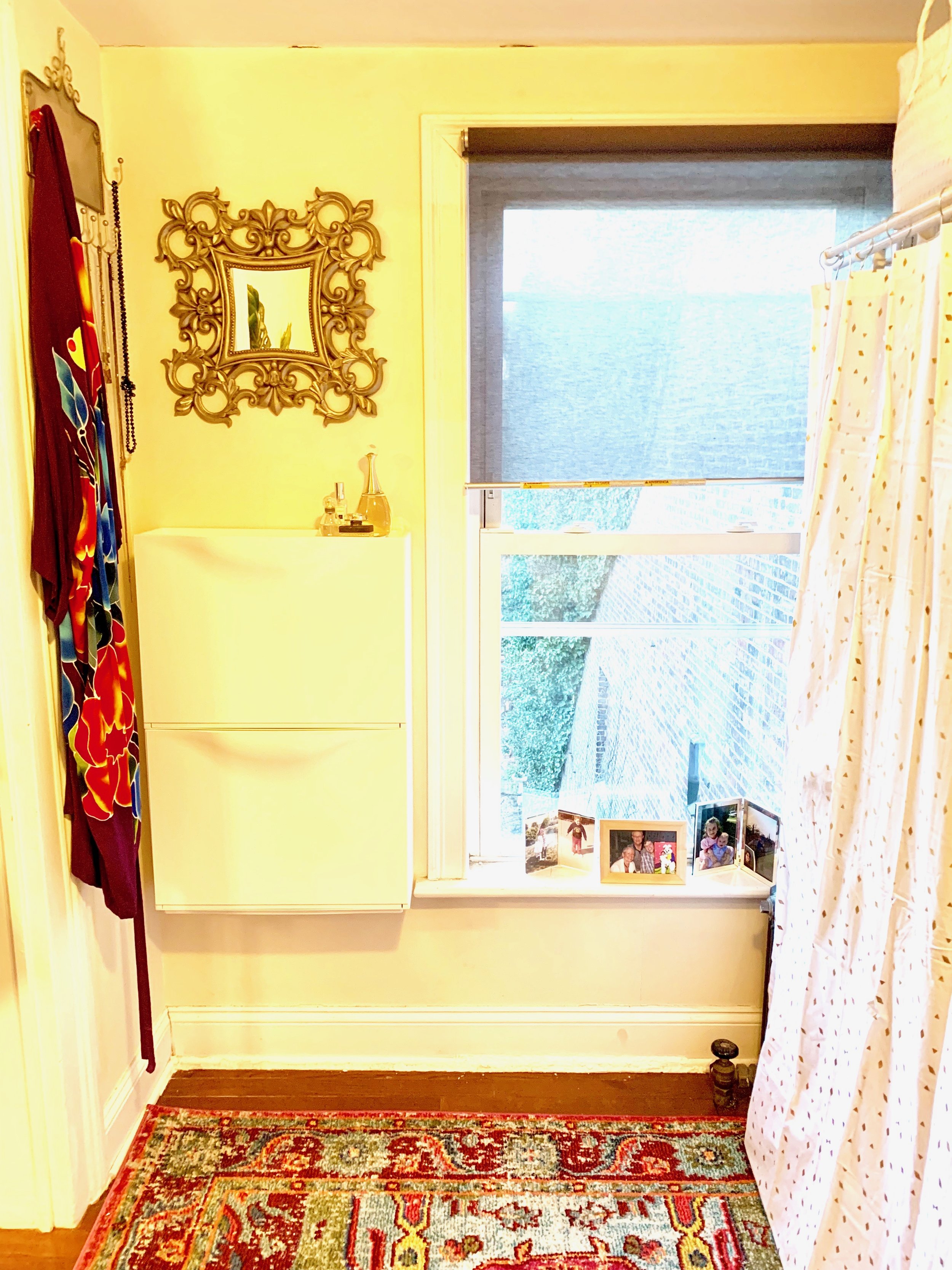
We didn’t forget the bedroom! …or, I suppose more appropriately the “sleeping nook.” It’s a GIANT walk in closet, but tiiiiiiiiiiiny bedroom. We opened up the space with narrow storage bins from Ikea, a couple of mirrors to bounce light around and a bright curtain to cover the clothes rack. The rattan Opalhouse mirror from Target adds the perfect touch of boho style.
We put in bright white basket storage above the clothes, and laid down the beautiful bright colored rug that was previously in the living room. We brought a few touches of gold in with a jewelry area mirror, flecks in the clothes curtain and the reading light. New bedding adds a bit of personality, and a soothingly comfortable place to curl up with a book at bedtime under the pretty new wall mounted plug in sconce.
Et voila! I could not be more pleased, my team could not be more supportive, and Becca could not be more gracious and thrilled with her one day redesign.
Now, she has a completely refreshed space to come home to…to cook in…to rest in….to host in…to read in….to plan and dream, and eat and sleep…
and LIVE in.
“i feel like i’m living in a hotel!” - becca


